Outcome: Redesigned navigation across the core Extend platform, improving discoverability for 100% of active customers while unblocking future product expansion.

I led the redesign of Extend’s navigation system, taking an initial concept and turning it into a user-centered solution ready for production. This redesign was a key step in positioning Extend as a spend management platform and enabling the company to monetize its expense management features for the first time.
What started as an MVP project quickly evolved into a more ambitious, long-term solution. Through user research, testing, and collaboration with stakeholders, I uncovered deeper usability challenges and helped realign the design to better meet both user needs and business goals. Along the way, I secured key stakeholder buy-in, with a second round of feedback confirming the changes were heading in the right direction.
The impact was significant. We resolved long-standing design debates, created a more intuitive user experience, and set up the product for growth. This work has set the stage for Extend to retain users, attract new ones, and confidently launch its paid spend management offerings.
My Role
Sole Product Designer
Duration
4 Months
Team
VP of Product
Cross-functional partners (for feedback purposes)
Overview
Redesigning the Navigation Menu for Extend’s Expense Management Platform
Extend is a rapidly evolving startup that started out providing virtual credit cards for small to medium-sized businesses (SMBs). Over time, they pivoted to become a robust expense management platform, offering features like receipt attachment and expense categorization.
The company wanted to charge users for these paid features while keeping the virtual card tools free. Unfortunately, the navigation didn’t make the expense management features obvious, and many users were unaware of the full potential of the platform.
Problem
Business Problem
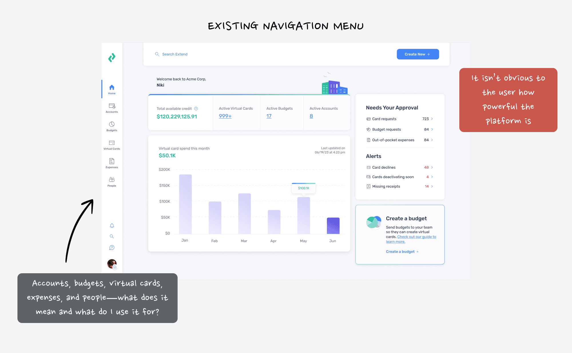
Extend’s current navigation structure mainly highlighted virtual card creation, which was great for initial user acquisition. But as the platform grew, the navigation failed to showcase its full suite of expense management tools.
With the move to paid plans, Extend needed to make these features front-and-center to drive adoption and justify the costs to users and stakeholders.
Design Problem
Users didn’t know about all the features available, and they weren’t sure how these features fit into their workflows. We needed to ensure the navigation was intuitive, without users feeling like they needed a step-by-step guide. And, given the diversity in how people used the platform, the navigation had to be flexible enough to accommodate different workflows.
Goal
Our primary goal was to create a navigation system that made Extend’s expense management features clear and intuitive. We aimed to retain current users, encourage them to adopt paid plans, and ensure the design was flexible enough to support diverse workflows without adding confusion.
Our primary KPI was user adoption and retention. We needed to validate that the new navigation met user needs while supporting the business goal of converting free users to paid plans.
Final Solution
The redesigned navigation system makes it easier for users to find what they need, no matter their role—whether they’re owners, admins, card managers, or guests. It’s a simpler, more intuitive way to explore the platform and actually see everything Extend has to offer.
The new navigation clears up confusion, smooths out the user experience across web and mobile, and sets the stage for Extend to grow into a spend management platform. It’s all about keeping current users happy and showing them why Extend’s paid features are worth it.
The Users & Audience
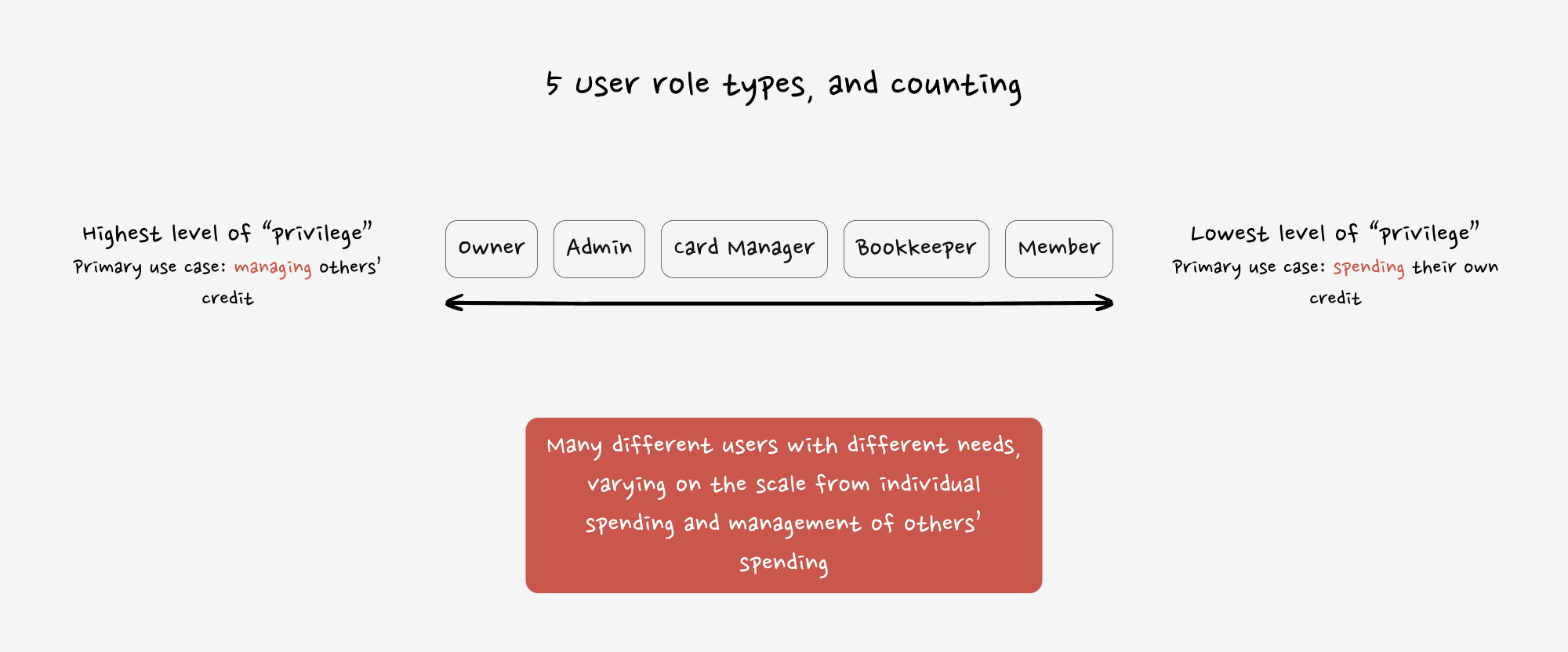
The users of Extend are as diverse as the businesses they represent. Internally, the product and design teams are active users of the platform, ensuring that all decisions are closely aligned with real-world needs. Externally, employees of SMBs across various roles (owners, admins, bookkeepers, etc.) use the platform, which created a challenge: different users had different needs, and many didn’t even have the correct roles assigned within the system.
This meant the navigation had to serve a wide range of user types with varying levels of access and needs. And while we didn’t have detailed personas, we worked with the data we had, focusing on users' actual behaviors and feedback to drive design decisions.
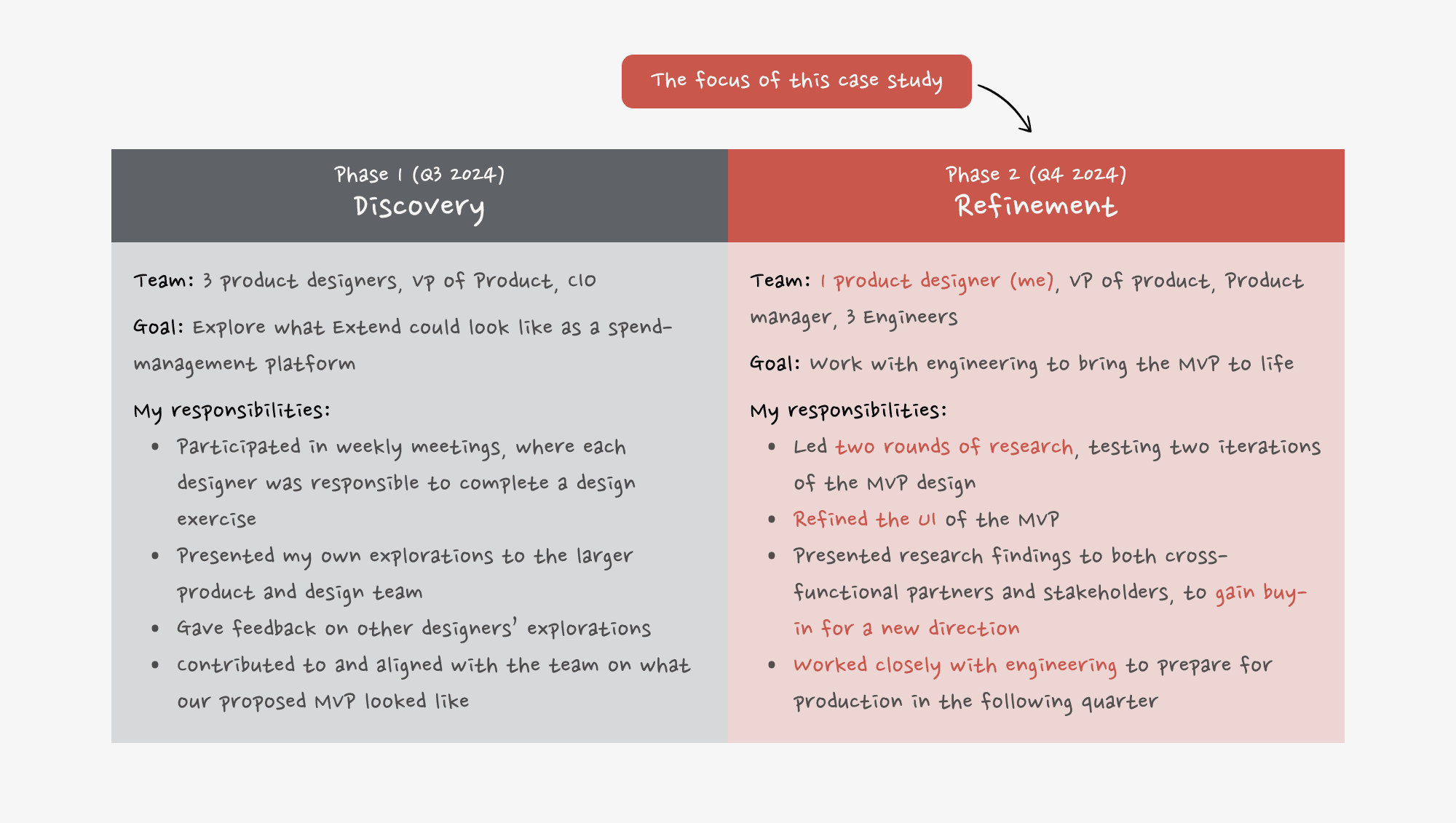
My Roles & Responsibilities
Phase 1
Initially, I worked as a product designer alongside a cross-functional team, helping to refine the overall concept for the navigation overhaul. We brainstormed and fleshed out the initial ideas, but our role was more exploratory.
Phase 2
After initial discovery with the broader team, I took the lead on research and testing, refining the UI and working closely with engineering to bring the design to life. I conducted tests, analyzed results, and iterated the design based on feedback. I also played a pivotal role in ensuring alignment with key stakeholders before presenting final designs.
Scope & Constraints
Phase 1
We had just one quarter to work outside of our usual “pod” responsibilities, collaborating closely as a team. We had regular check-ins with leadership (VP of Product and CIO) to align on the vision.
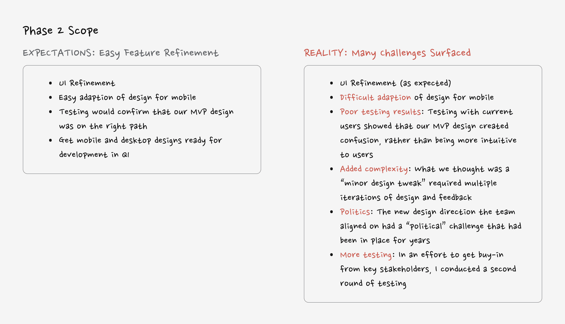
Phase 2
After the initial concept was approved, the project was handed to my pod to develop. The design had to account for both mobile and web versions, and we quickly realized the scope was much larger than we thought, especially with mobile design and iterations needed across both platforms.
Process
Navigating the Pivot: Key Steps in the Process
Beyond improving the UI, this navigation redesign required strategic thinking, careful testing, and driving alignment across teams.
Key Process Highlights:
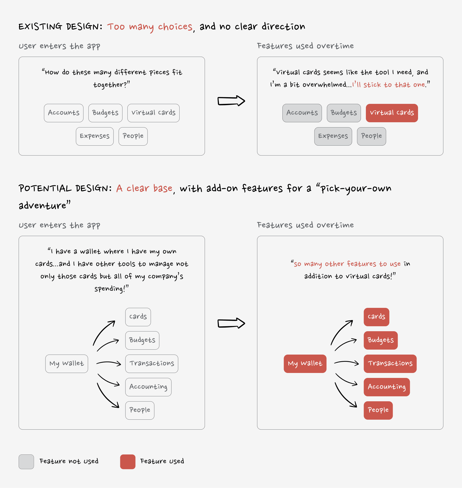
Inheriting an MVP Concept with Gaps: I started with a two-spaces model that divided navigation into “personal” and “company” spaces. Early research revealed this structure was confusing, with 27% of users landing in the wrong space.
Uncovering Mobile Design Challenges: While adapting the web design for mobile, I discovered the two-spaces model was even more confusing on smaller screens. This realization pushed us to rethink the structure entirely.
Challenging Old Assumptions with Data: Historical design debates had blocked progress in the past. I pitched a new, consolidated navigation model and used testing insights to prove it was the stronger solution.
Testing, Learning, and Iterating: I ran tree tests and prototype evaluations, iterating the design based on user feedback. After a second round of testing, we confirmed the consolidated model improved clarity and usability.
Aligning Stakeholders for Buy-In: Throughout the process, I strategically socialized ideas and testing results with key stakeholders to build support. This ensured the final design resolved past debates while setting Extend up for future growth.
This step-by-step approach helped us transform an initial concept into a solution that was easier to use, flexible for different workflows, and scalable as the platform evolves.
Final Design
Extend’s Navigation with “One Consolidated Space” Could Help Boost Discoverability of Extend’s Expansive Feature Suite
“One Consolidated Space” Overview
The final design of Extend’s navigation represents a balance between clarity, flexibility, and scalability. By consolidating spaces and empowering users with tools to customize their experience, there is a foundation for better usability and long-term growth. The redesign includes:
A single, consolidated space that eliminates confusion.
Intuitive filtering and sorting for quick access to information.
Visual and functional updates to guide users effortlessly through the platform.
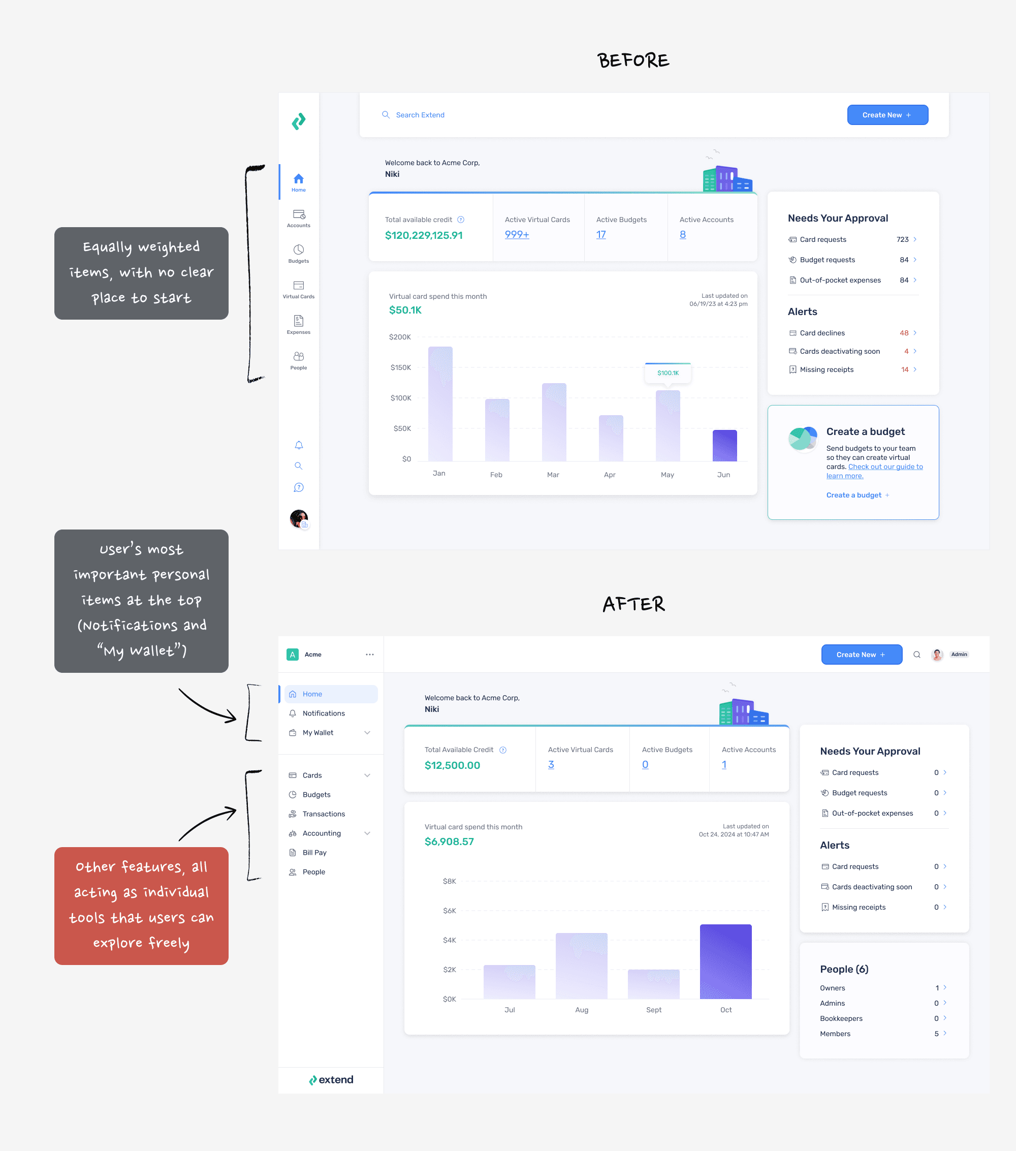
A Grounding Home: Only the Essentials
The top section of the navigation menu highlights the essentials used most often—home, notifications, and their wallet. These elements are placed in prime real estate, ensuring users can quickly find their most-needed tools without distractions.
Streamlined Simplicity: By narrowing the scope of the top section to just the essentials, we reduced cognitive load and helped users focus on what matters most.
Fast Access: Frequent actions like checking transactions, receiving updates, or managing payments are just a tap away.
This approach grounds users with a familiar, purpose-driven starting point every time they log in.

The Stand-Alone Features: Built to be Monetized
Not every user has the same workflows or needs—and some features are used only by specific roles or in specific contexts. The lower section of the navigation separates these stand-alone features into their own category, creating a clear distinction from the core tools.
Role-Driven Flexibility: Features like expense management or accounting tools are displayed for exploration but aren’t pushed on users who don’t need them.
Upsell Potential: By isolating features that can be monetized, Extend is positioned to market them as premium add-ons without overwhelming the user experience.
This separation makes the platform feel adaptable and less cluttered while giving users the freedom to explore when it suits them.

Summary
The redesigned navigation simplifies Extend’s interface, highlights its most valuable tools, and sets the stage for growth. By focusing on user essentials, separating stand-alone features, and empowering personalization, we created a design that meets user needs today while preparing for tomorrow.
Reflection
Outcomes & Lessons Learned
Beyond visual cleanup this redesign helped users orient themselves in a growing product and reducing friction as the platform scaled.
Key Outcomes
Improved usability through simplification: Consolidating “personal” and “company” spaces reduced cognitive overhead and made core workflows easier to find, especially for repeat users.
Stronger organizational alignment: Multiple rounds of user validation helped resolve long-standing internal debates around platform structure and earned buy-in from senior leadership.
A more scalable foundation: The updated navigation created space for future features without increasing complexity, setting the product up for continued growth.
Key Learnings
User evidence accelerates decisions: Research didn’t just validate the design, it helped unblock years of internal disagreement.
Alignment is a key part of the work: Navigation touches everything. Regular cross-functional check-ins were critical to keeping momentum and avoiding downstream surprises.
If extended further, the next phase would focus on saved views, smarter defaults, and lightweight education to help users adapt as the platform evolves.
Continue Reading
What to Explore Next
If you’re interested in in consumer-facing product work and decision-making at scale, I’d recommend:
Or, head back home to explore my other work.